Data Analysis & Visualization
Analyze Extole data in your data visualization tool.
Overview
Integrate data from your Extole programs with your own data visualization tool to better understand, socialize, and optimize program performance with your internal teams.
Use Cases
- Analyze funnels for conversion to understand the effectiveness of your experience for advocate and friends
- Understand customer volume and quality by determining what percentage of new customers are coming from your Extole-powered programs and comparing the Lifetime Value (LTV) of those customers and those from other channels.
- Monitor program costs to compare the Customer Acquisition Cost (CAC) of your Extole-powered programs to other marketing channels and understand your program reward spend.
Steps to Integrate using Extole’s Reporting API
If you're looking to analyze conversion funnels or understand the type of customers coming from your Extole programs, we recommend that you create an Events report and schedule the report to run on a regular basis.
Configure Events Reports
Your first step will be to configure the Events Report. This report will return rows of each event (shared, clicked, converted) with the accompanying data such as source, cart value, etc which then can be used to create these visualizations.
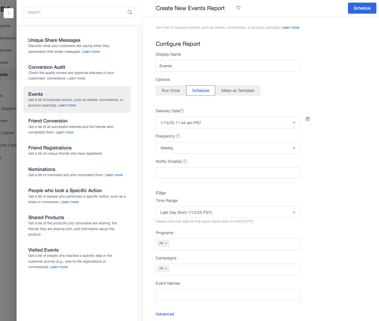
Next you will want to set the filters:
- Specify the programs and campaigns you'd like to include
- Select the following Event Names depending on which experience you want to analyze:
| Event Names | Description |
|---|---|
| Promotion Clicked | Number of clicks on in-app promotions, onsite promotions, email promotions, or promotion links posted on social channels |
| Shared | Number of explicit shares from the share experience plus number of times an advocate has copied their share link from the share experience |
| Clicked | Number of clicks on share links |
| Signed Up | Number of emails captured on Extole hosted Friend Landing Experience |
| Converted | Number of friend conversions |
| Free Trial Started / Account Opened / Funded | Based on your unique events, any custom events will be available as well |
Tip: Customizing FieldsBy default there are a variety of fields available in this report, customize the report columns for campaign, program, share channel, promotion source, device, and reward type to align with your needs. These can be adjusted in the Advanced menu of the report configuration screen.
For additional help, read our more detailed documentation on how to create an Events report.
Configure a Fulfilled Rewards Report
If you're looking to monitor the CAC or reward spend of your programs, we recommend that you create a Fulfilled Rewards report and schedule the report to run on a regular basis. This report will pull in all the rewards that have been fulfilled and their associated participant.
Schedule the Report
Once you are happy with the output of the report, duplicate your report and update the report to run on a schedule
- Set the option to Schedule instead of Run Once
- Set your desired Delivery Date (the day and time we will run and deliver the report)
- Set the frequency with which the report will be generated and delivered to you
- Enter the emails to which the reports should be delivered
Finally, you can hit the Schedule button in the top right to kickoff the report.
Get the API Call for Your Report
Follow the instructions in our Reporting API documentation to generate an access token and make an API call to execute your scheduled report. Extole also supports sending reports to SFTPs.
Create Your Data Connector
Create a custom data connector in your data visualization tool using the access token and API call from the step above.
- How to Create a Web Data Connector in Tableau
- How to create a Custom Connector in Microsoft Power BI
- How to create a Studio Connector in Looker Studio
Verify Data & Start Building Visualizations
Once you've set up the connector in your data visualization tool, all you need to do is verify that the expected data is being passed from your Extole programs. If everything looks correct, you're ready to start building your visulizations!
Updated 6 months ago